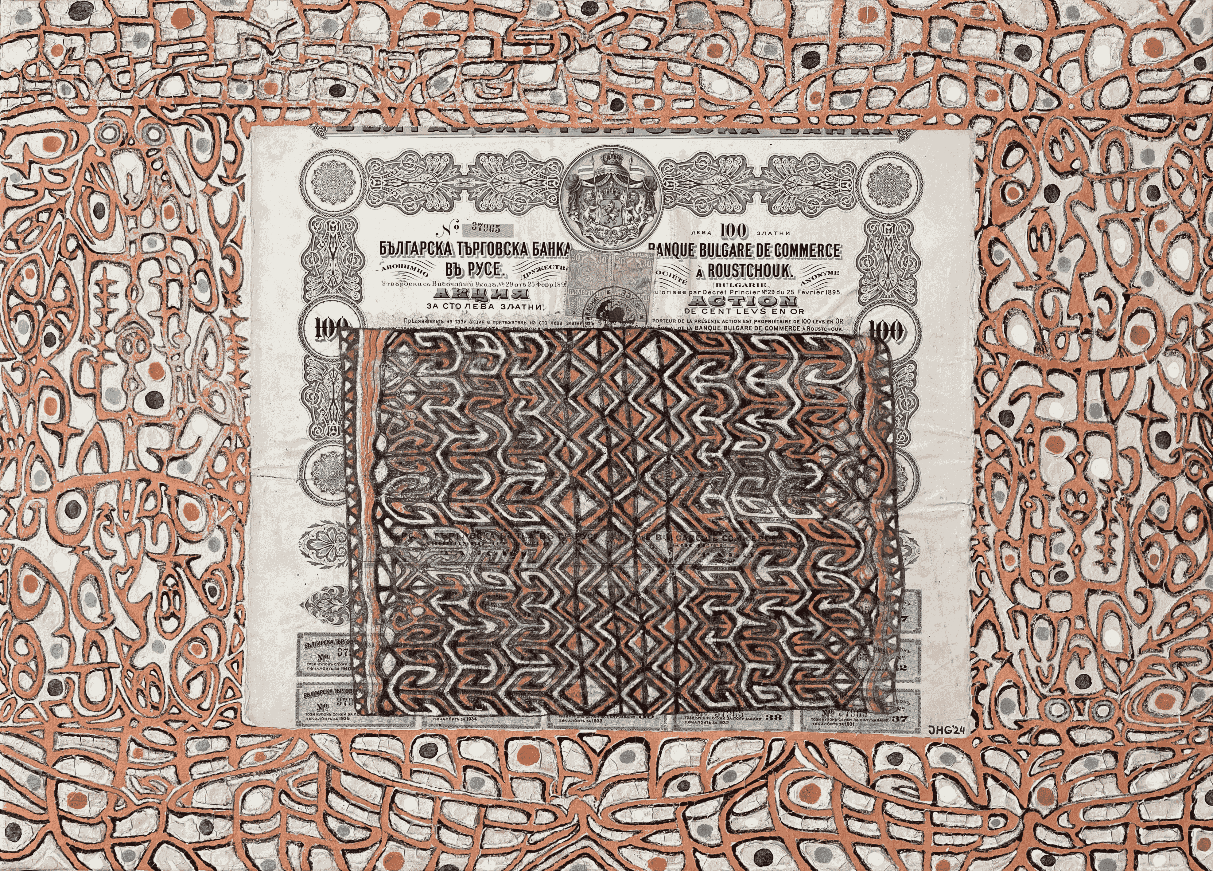
Souvenir de Roustchouk à la Asmat
2024
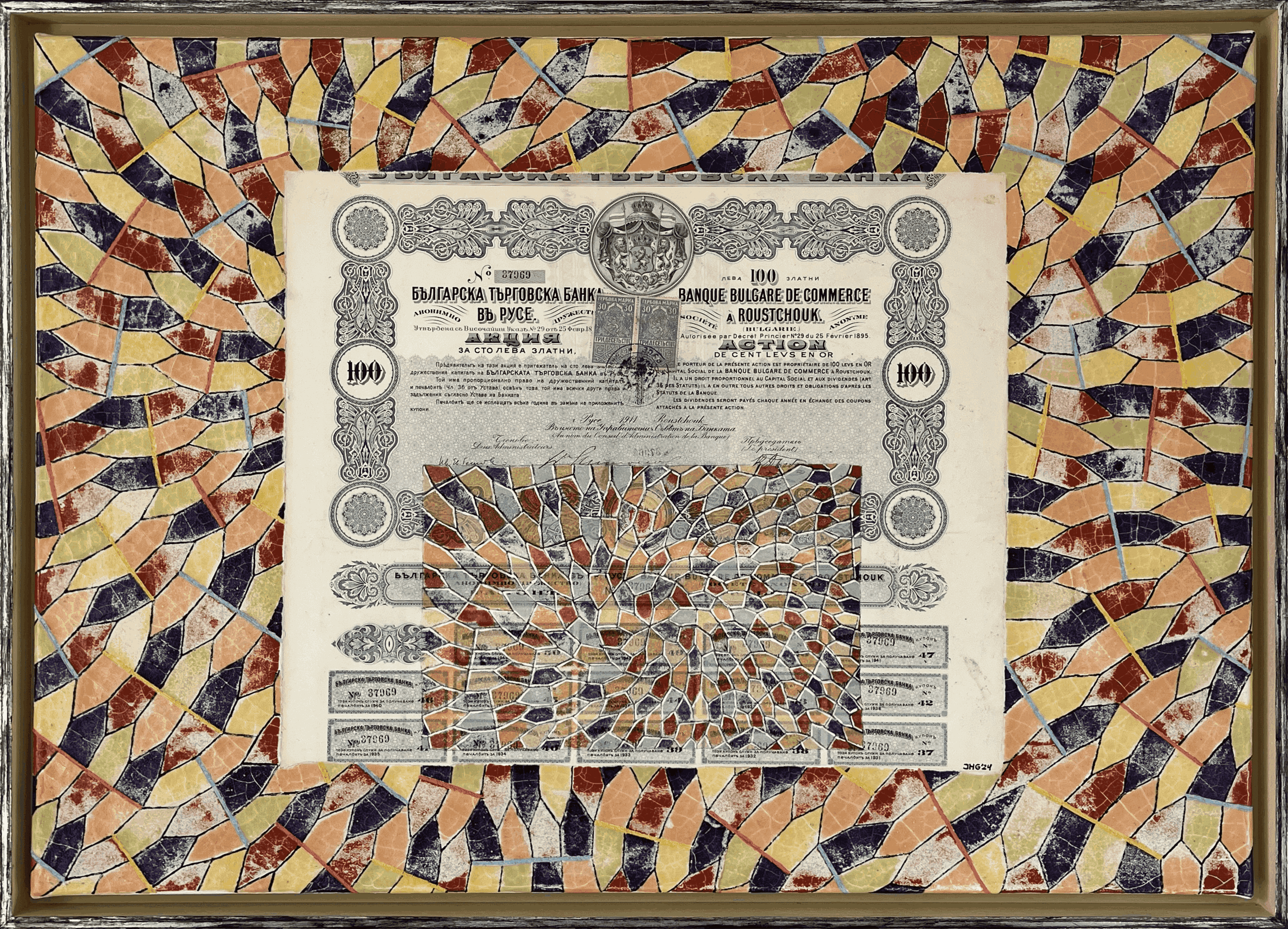
Souvenir pentagonale de Roustchouk
2024
Composition 2024
2024
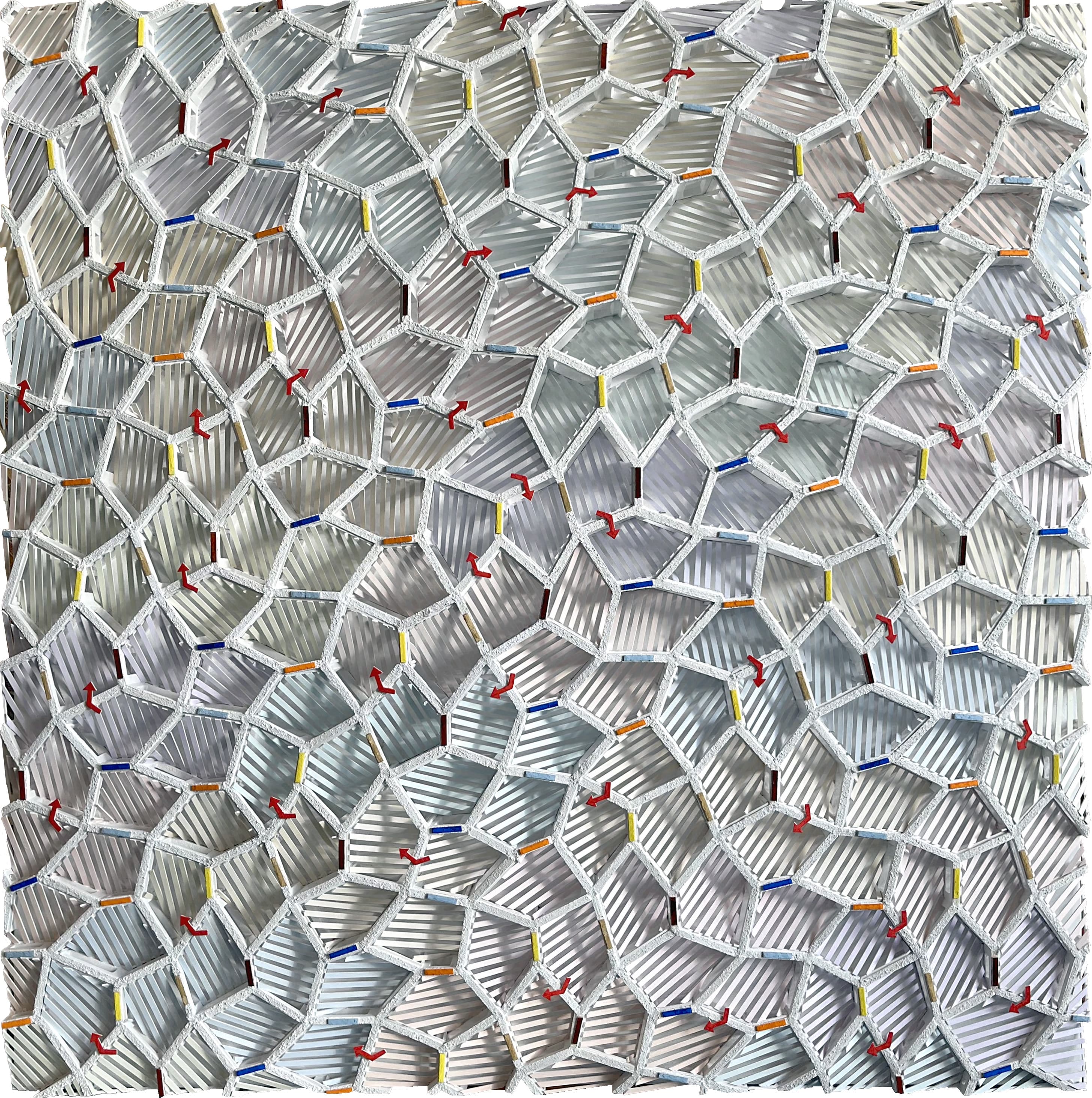
Composition 2025
2025
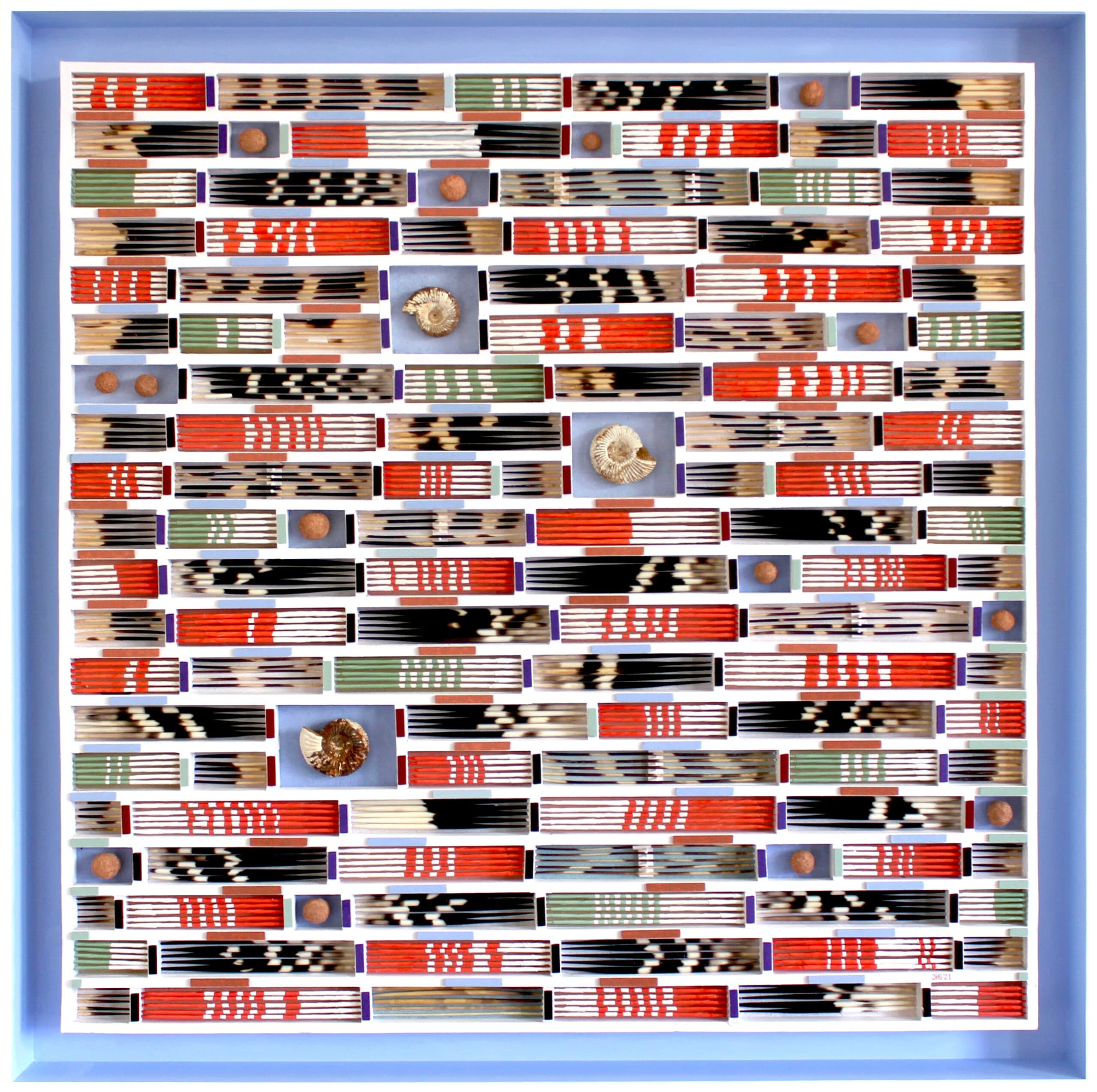
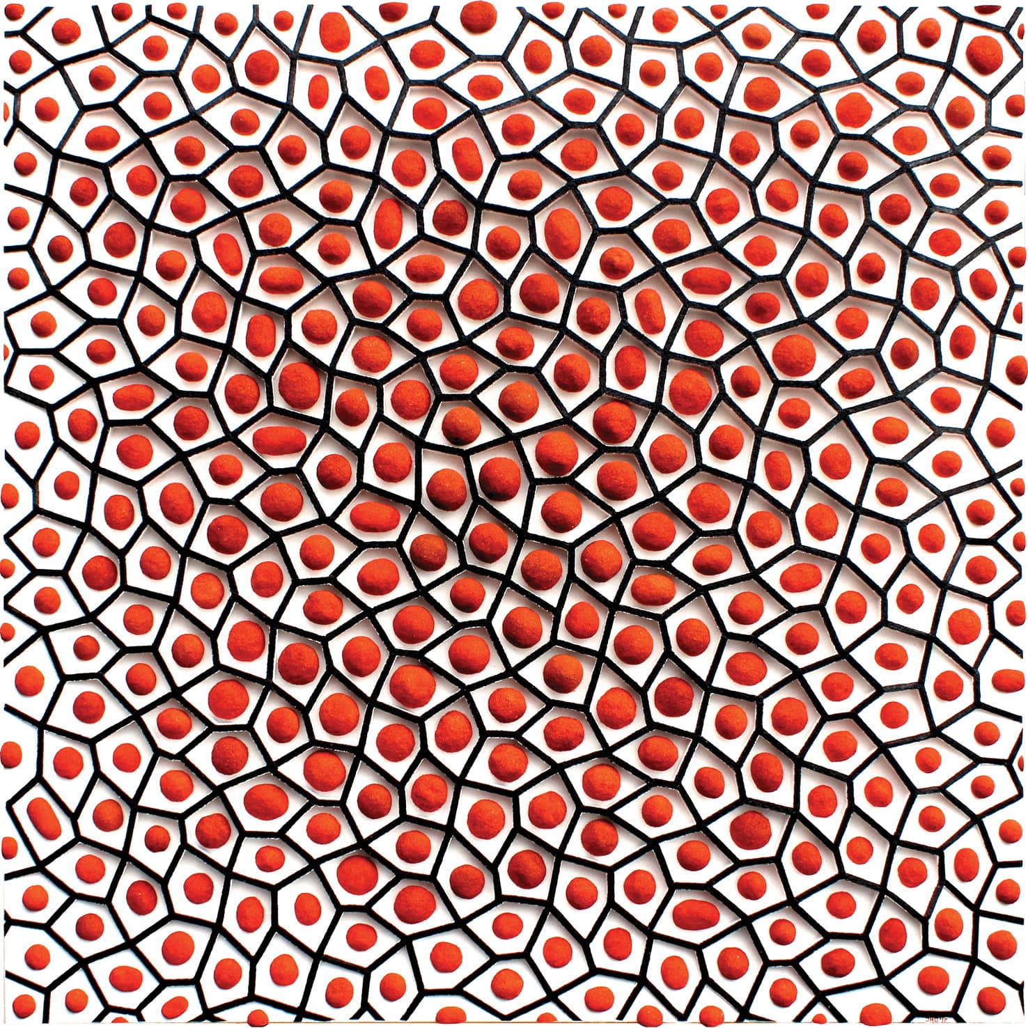
Porcupine I
2021
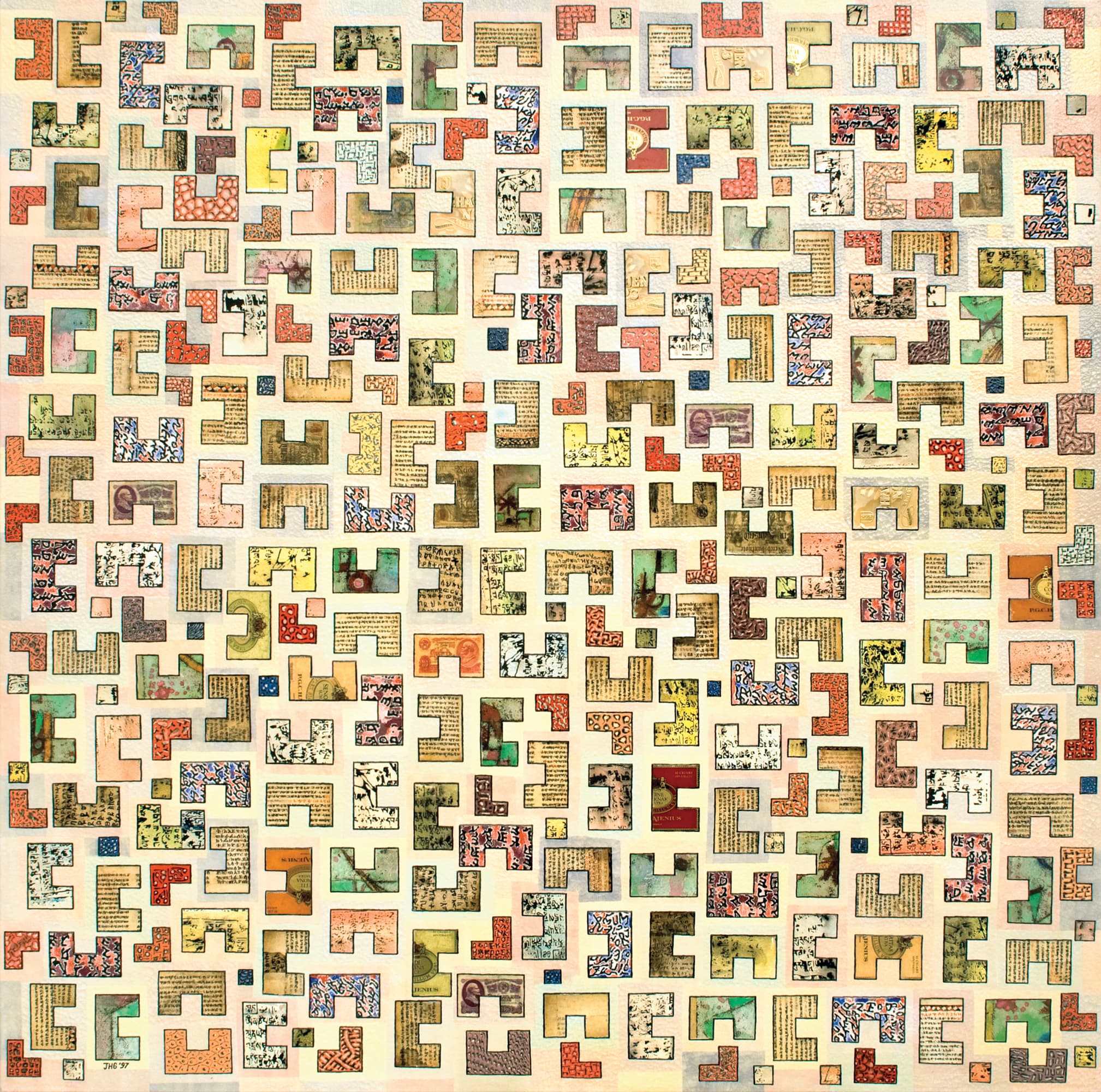
Division of the plane with various elements
1997
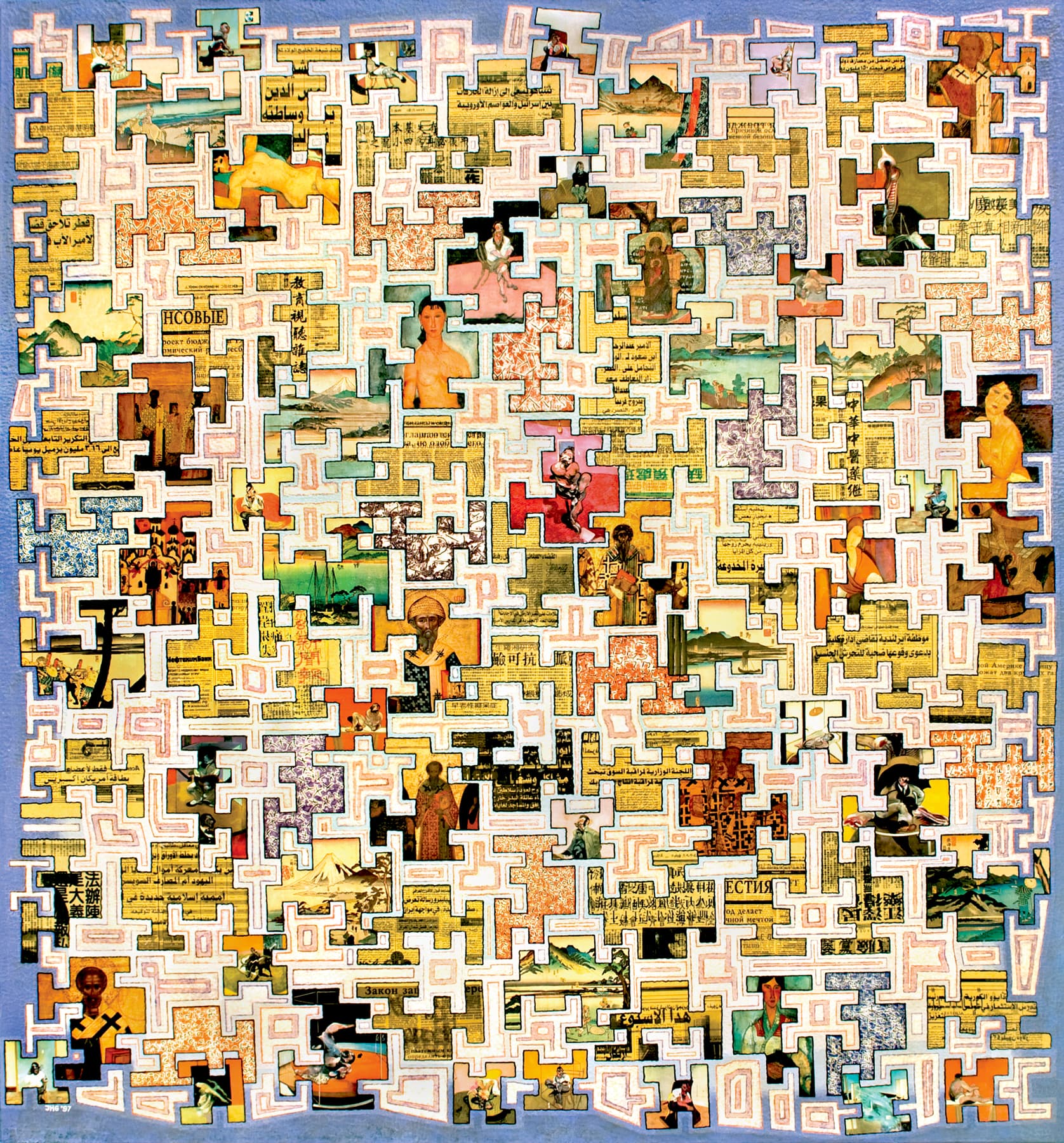
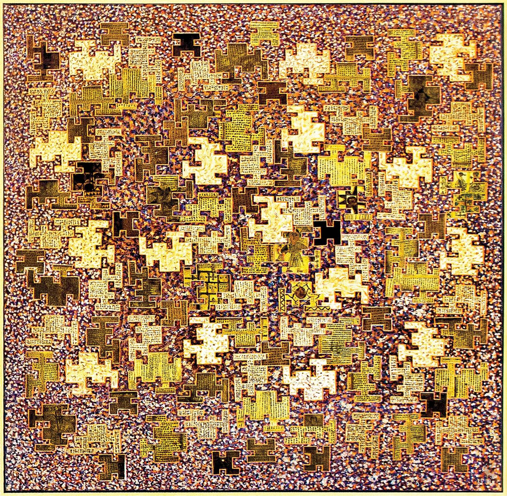
Disconnected tiling old and modern
1997
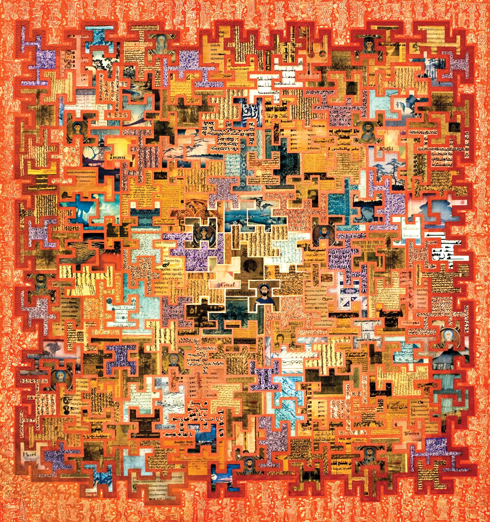
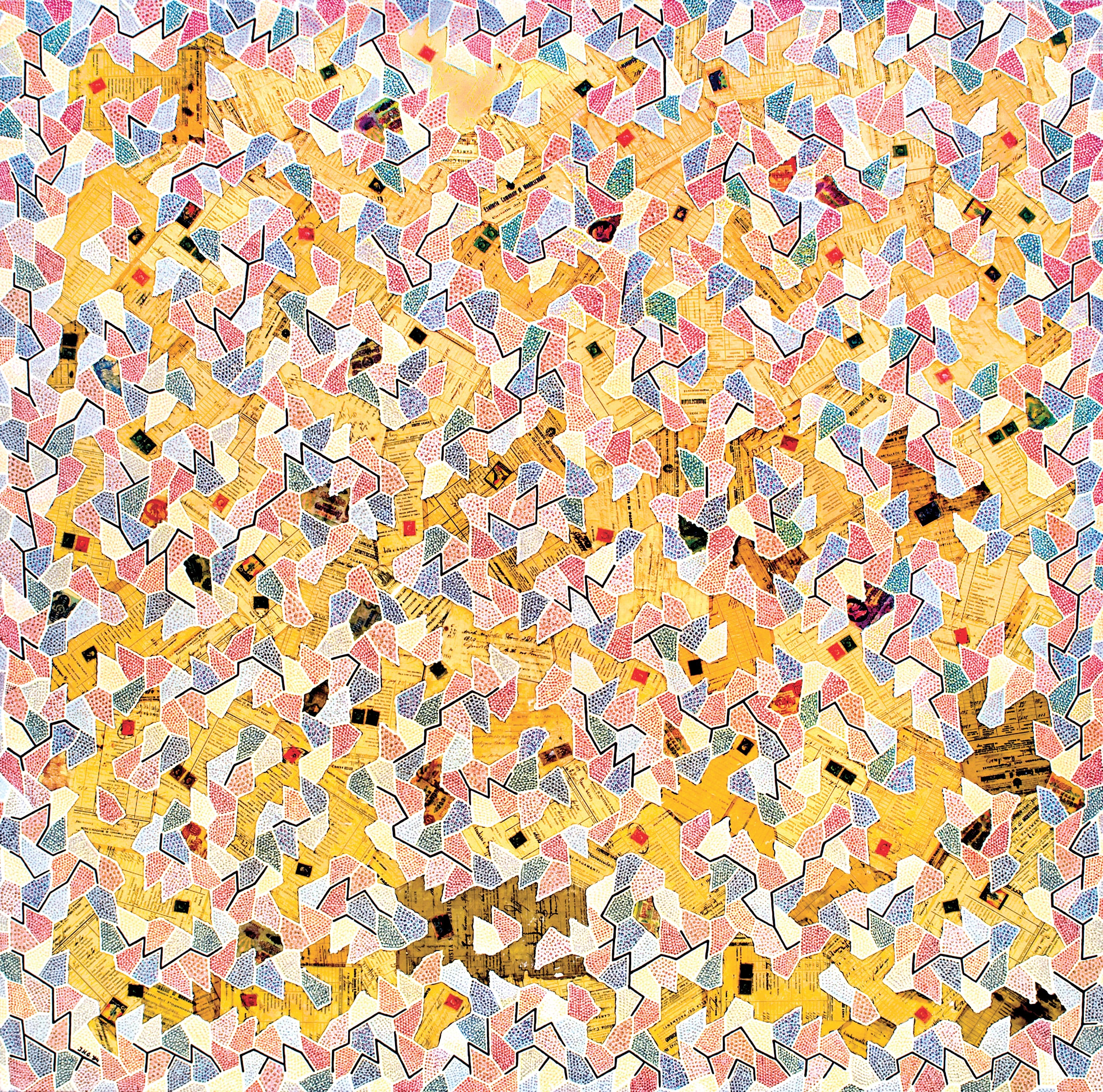
Tiling with handwritings
1997
Changing pattern with opening
1990
%202012%2C%2040%20x%2050%20cm.jpg&w=3840&q=75)
Cepir-344 . Russian stock paper 1906
2012
Fabrication des Bouteilles à Odessa I
2005
Mines et Usines Zinc de Silésie
2007
François Rive 60
2015
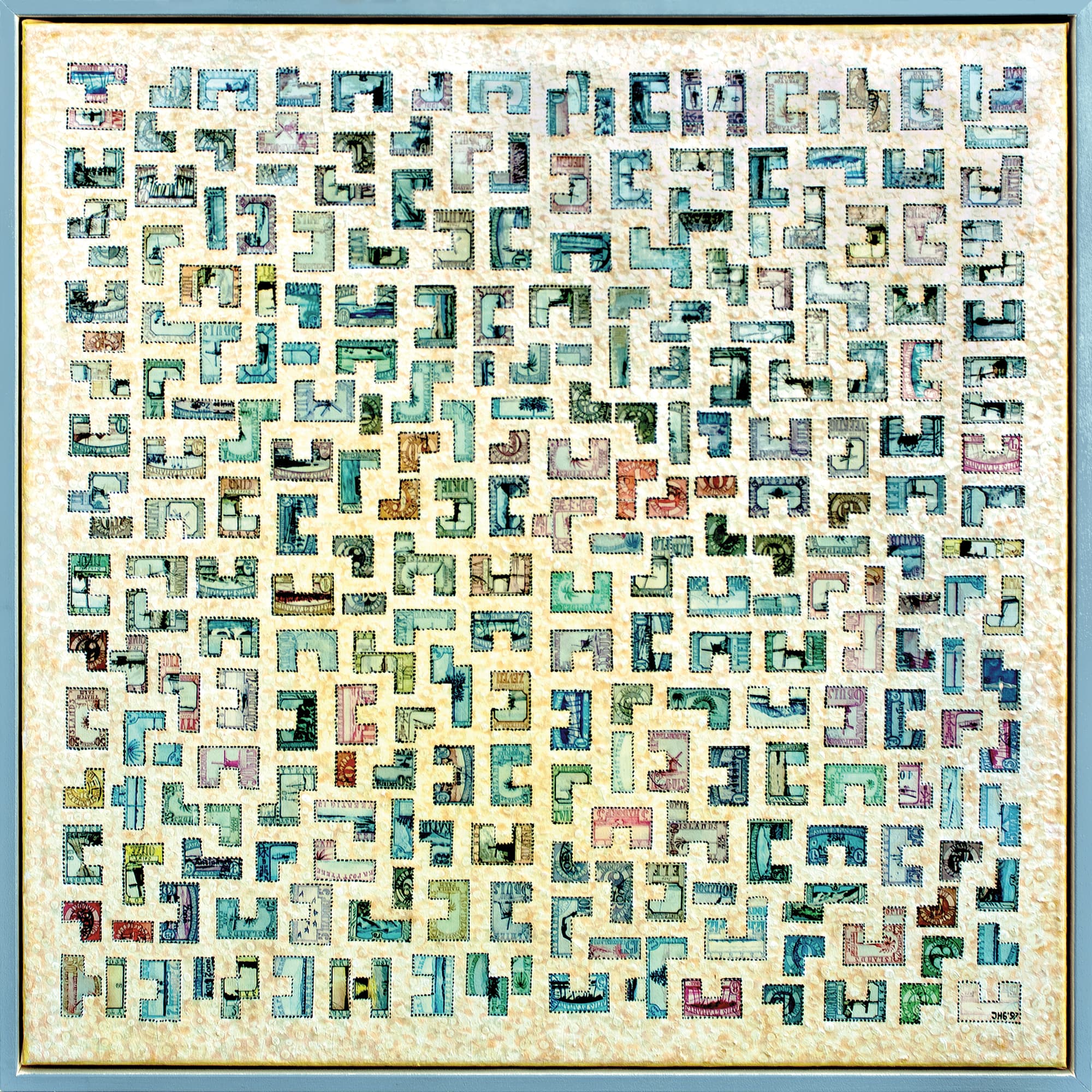
Division of the plane with stamps
1997
Disconnected Coptic tiling
1996
Tuscan tiling I
1994
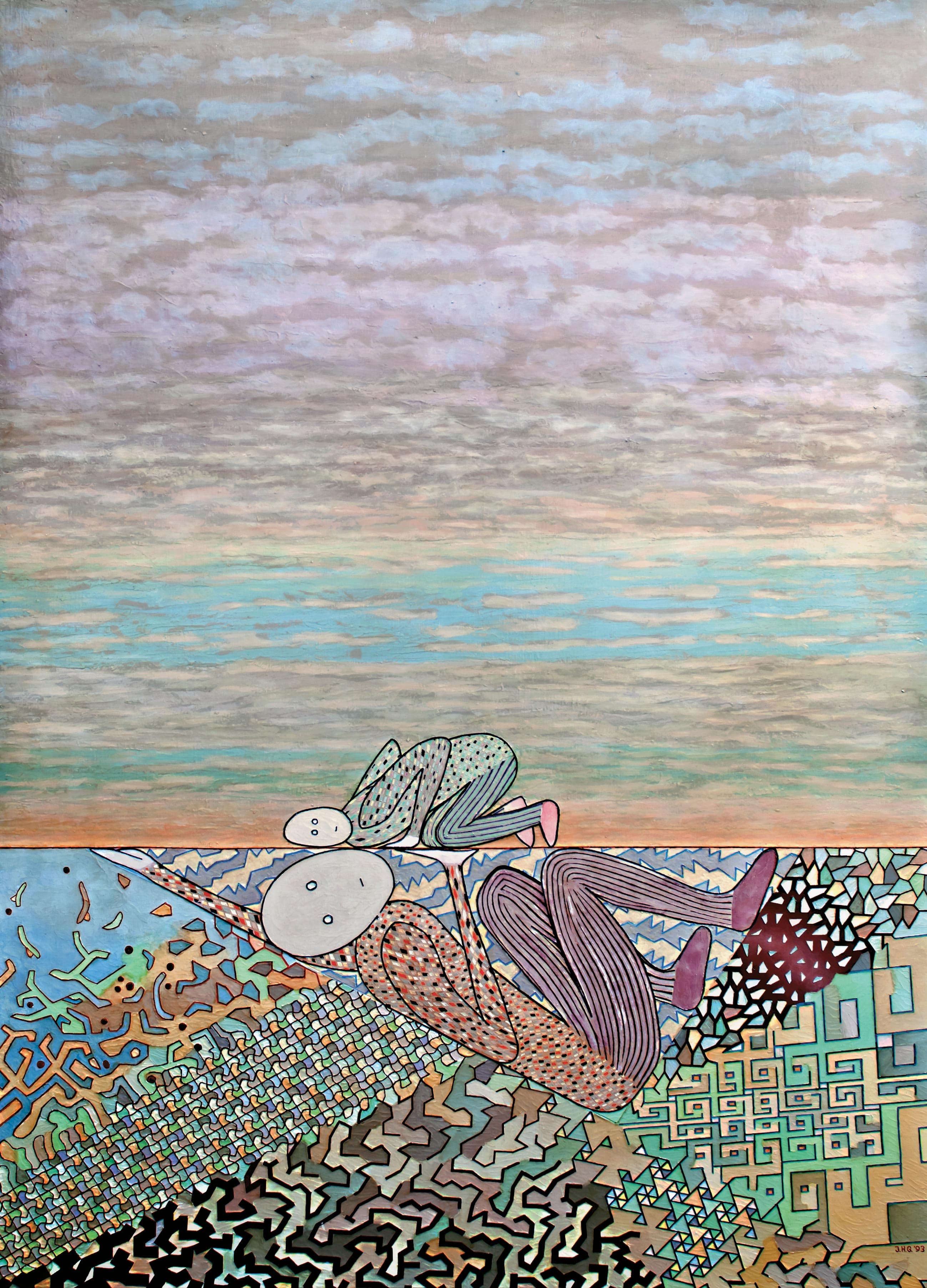
Two worlds
1993
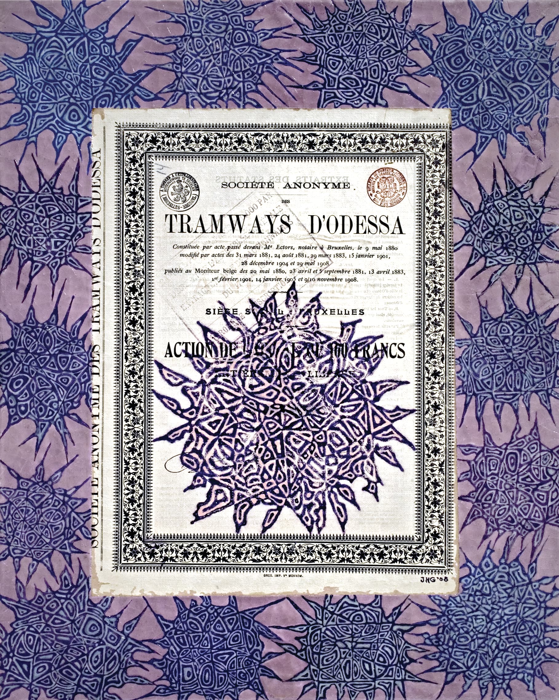
Tramways d'Odessa II
2008
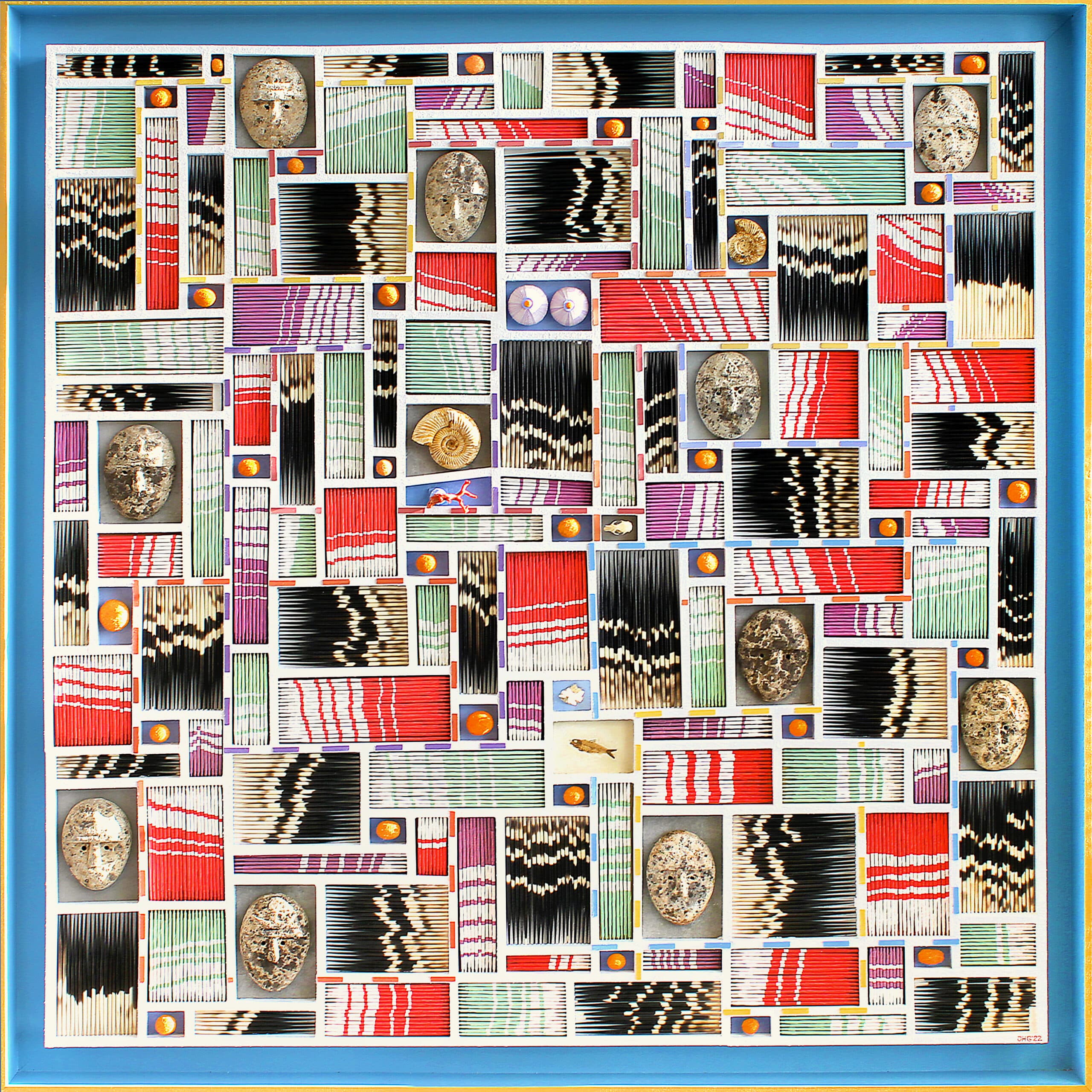
Composition No.2
2022
Composition 2017
2017
Porcupine Boogie Woogie II
2022
.jpg&w=3840&q=75)
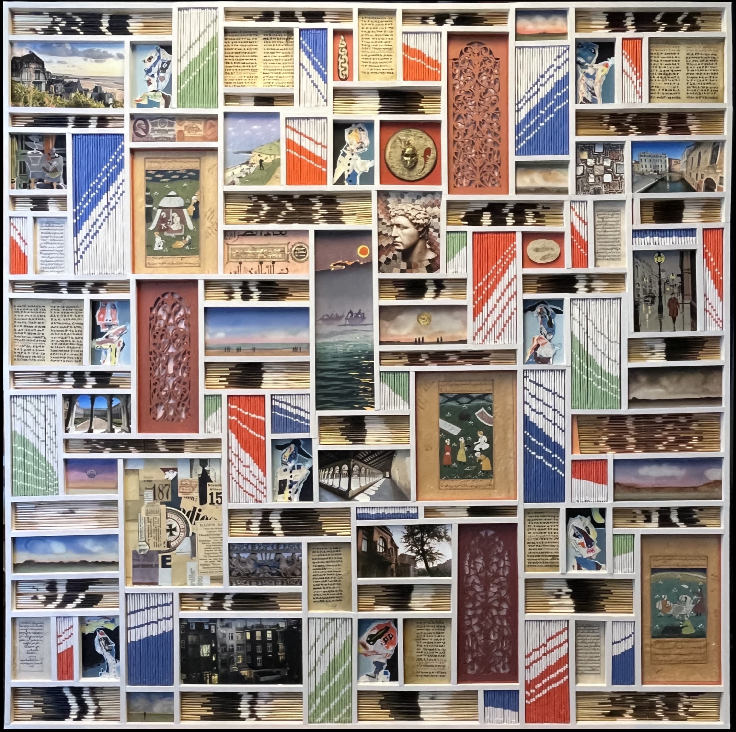
Composition 2014
2014
Selected Works
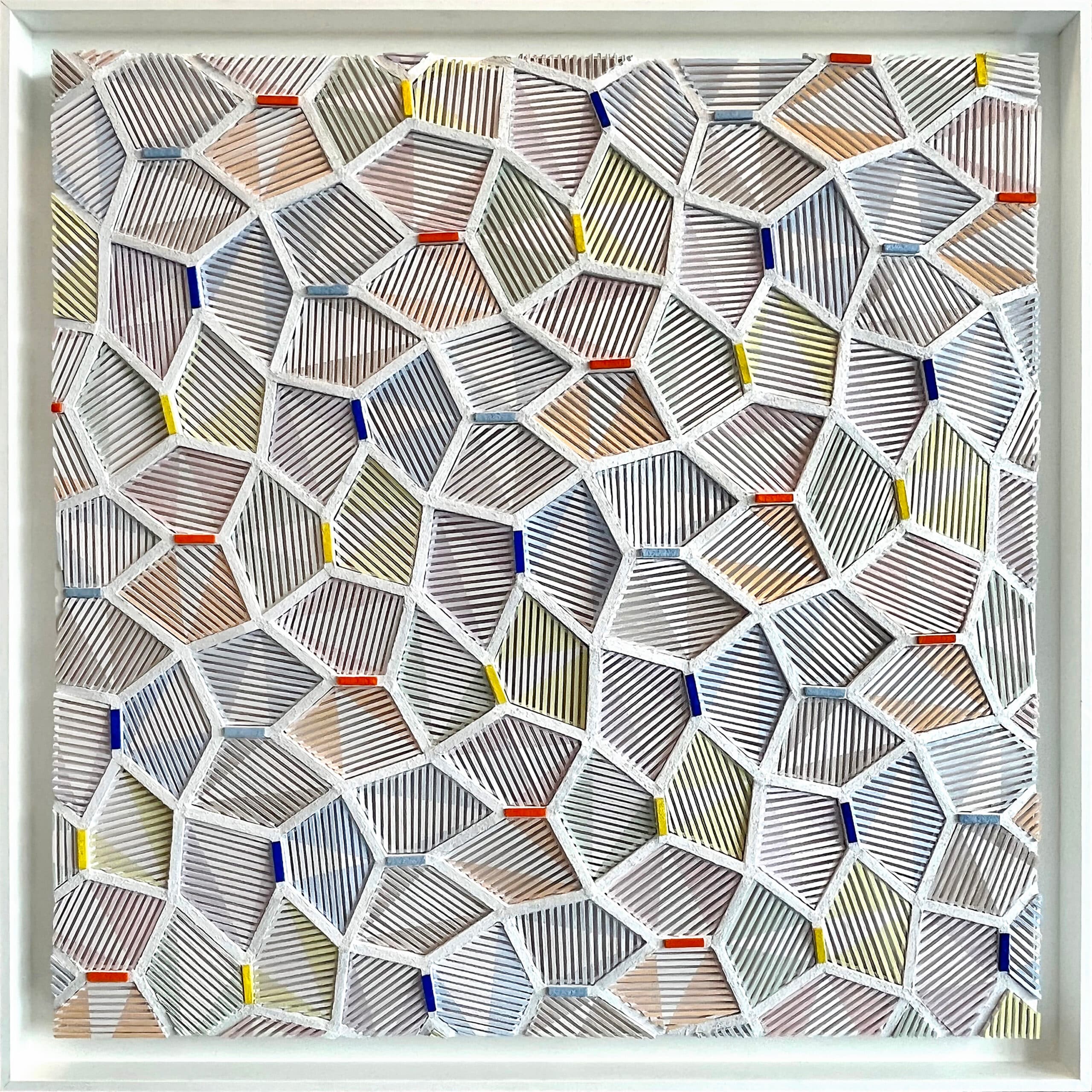
Composition 2017
2017
A large-scale abstract composition with harmonious geometry and natural materials
Porcupine Artworks
2021
A series of works using porcupine quills as the primary medium
Composition No.2 - 2022
2022
A sophisticated geometric composition with bold colors
About the Artist
Jaap Goedemoed is an Amsterdam-based artist known for his distinctive geometric abstractions and innovative use of materials. His works explore mathematical patterns, particularly pentagonal tessellations, creating intricate structures that balance precision with artistic intuition.
With influences from ethnographic art and modernist traditions, Goedemoed creates compositions that bridge cultural and artistic boundaries, incorporating found materials and historic documents.